由于互联网世界正在发生变化,人们往往喜欢那些有更多互动元素的网站,因此现在很多设计师专注于他们的 CSS3 技能。这是因为 CSS3 技能可以帮助他们在很大的程度上实现所需的吸引力。这里分享的20个优
日常CSS_仿苹果平滑开关按钮
顺晟科技
2021-06-30 17:14:57
281
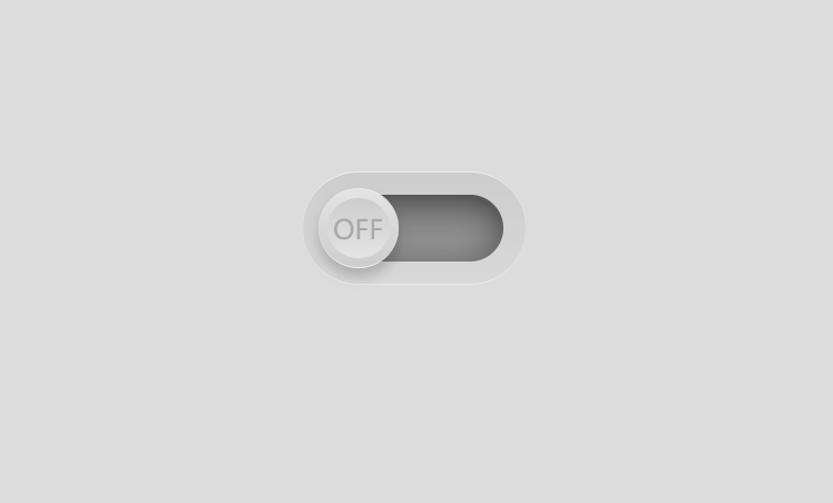
每日CSS_仿苹果平滑开关按钮
2020_12_24
源码
1. 代码解析
1.1 html 代码解析
<div class="checkbox">
  <div class="inner" id="inner">
    <div class="toggle" id="toggle"></div>
  </div>
</div>
最外层 checkbox, 是按钮的整体, inner 是ON下绿色框所占的区域, toggle 是能点击的 ON 和 OFF 区域.
1.2 css 代码解析
- 设置 body 字体和背景色
body{
  margin: 0;
  padding: 0;
  font-family: sans-serif;
  background: #dcdcdc;
}
- 设置按钮的背景色, 位置, 圆形边框, 上下边框颜色和厚度
.checkbox{
  position: absolute;
  top: 50%;
  left: 50%;
  transform: translate(-50%, -50%);
  width: 100px;
  height: 50px;
  border-radius: 25px;
  background: linear-gradient(0deg, #d8d8d8, #cccccc);
  border-top: 0.02em solid #ececec;
  border-bottom: 0.02em solid #ececec;
}
-
设置 绿色底色区域 的上下左右位置, 以此确定宽度和高度, 注意, 这里没设宽度和高度, 默认是 auto
设置背景, 圆形边框, 阴影
.checkbox .inner{
  position: absolute;
  /* 因为没设宽和高, 所以可以这样 */
  top: 10px;
  left: 10px;
  right: 10px;
  bottom: 10px;
  background: linear-gradient(0deg, #a5a5a5, #717171);
  border-radius: 20px;
  box-shadow: inset 0 0 15px rgba(0,0,0,.5);
}
- 设置 ON OFF 按钮大小, 位置, 颜色, 背景, 阴影, 顶部和底部边框样式, 设置按钮上的动画时间为 0.5s
.checkbox .inner .toggle{
  position: absolute;
  top: -3px;
  left: -3px;
  width: 36px;
  height: 36px;
  border-radius: 50%;
  background: linear-gradient(0deg, #ccc, #e4e4e4);
  box-shadow: 0 4px 6px rgba(0,0,0,.2);
  box-sizing: border-box;
  border-top: 0.04em solid #ececec;
  border-bottom: 0.01em solid #ececec;
  transition: 0.5s;
}
- 设置 OFF 的样式,, 由上下左右的定位确定 宽和高, 设置背景, 圆形边框,
line-height用来设置字体垂直居中
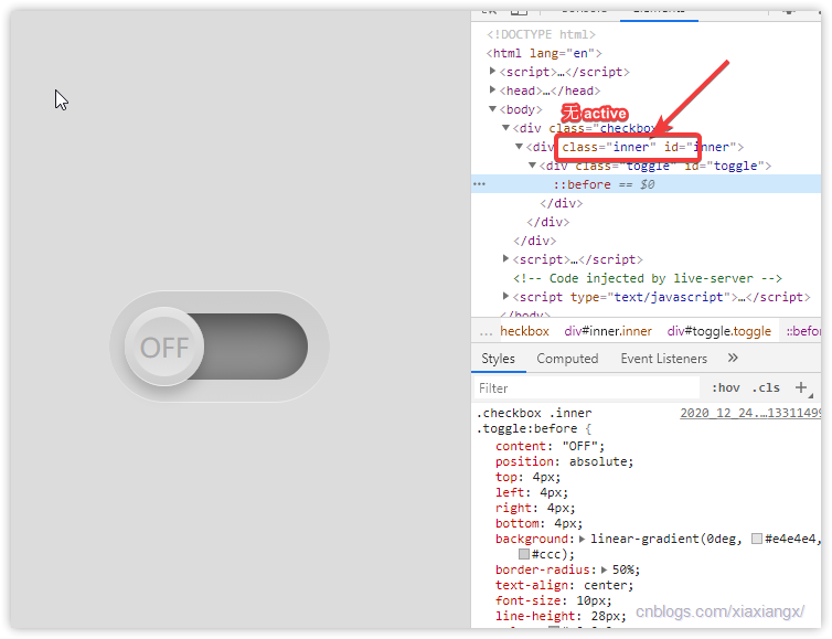
.checkbox .inner .toggle:before{
  content: "OFF";
  position: absolute;
  top: 4px;
  left: 4px;
  right: 4px;
  bottom: 4px;
  background: linear-gradient(0deg, #e4e4e4, #ccc);
  border-radius: 50%;
  text-align: center;
  font-size: 10px;
  line-height: 28px;
  color: #a9a9a9;
}
- 设置 点击后按钮的字体, ON, 之所有没有写其他属性, 是因为其他属性都继承
checkbox .inner .toggle:before
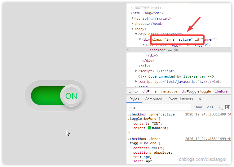
.checkbox .inner.active .toggle:before{
  content: "ON";
  color: #00d22d;
}
- 当按钮被点击, 滑块右移, 并且更改背景色, 更改时间为 0.5s
.checkbox .inner.active .toggle{
  left: 47px;
}
.checkbox .inner.active{
  background: linear-gradient(0deg, #00d22d, #158a00);
}
1.3 javascript 代码解析
<script>
  let inner = document.getElementById('inner');
  let toggle = inner.children[0];
  toggle.addEventListener('click', ()=>{
    if(inner.classList.contains('active')){
      inner.classList.remove('active');
    }else {
      inner.classList.add('active');
    }
  })
</script>
- 首先获取到 inner 和 toggle, 一个背景色框, 一个圆形按钮
- 给按钮 toggle 注册点击事件, 点击 ON OFF 按钮才有效
- 当 inner 处于 active, 也就是 inner 元素包含 active 类, 那就移除, 如果不包含, 那就添加, 反正做一个相反的操作
- 当 inner 处于 active, toggle 会右移, inner 背景色会变换, 在 css中 设置
- 大功告成, 过程如下图
2. 源码
2.1 html 源码
<!DOCTYPE html>
<html lang="en">
<head>
  <meta charset="UTF-8">
  <title>Title</title>
  <link rel="stylesheet" href="2020_12_24.css">
</head>
<body>
<div class="checkbox">
  <div class="inner" id="inner">
    <div class="toggle" id="toggle"></div>
  </div>
</div>
<script>
  let inner = document.getElementById('inner');
  let toggle = inner.children[0];
  toggle.addEventListener('click', ()=>{
    if(inner.classList.contains('active')){
      inner.classList.remove('active');
    }else {
      inner.classList.add('active');
    }
  })
</script>
</body>
</html>
2.2 css 源码
body{
  margin: 0;
  padding: 0;
  font-family: sans-serif;
  background: #dcdcdc;
}
.checkbox{
  position: absolute;
  top: 50%;
  left: 50%;
  transform: translate(-50%, -50%);
  width: 100px;
  height: 50px;
  border-radius: 25px;
  background: linear-gradient(0deg, #d8d8d8, #cccccc);
  border-top: 0.02em solid #ececec;
  border-bottom: 0.02em solid #ececec;
}
.checkbox .inner{
  position: absolute;
  /* 因为没设宽和高, 所以可以这样 */
  top: 10px;
  left: 10px;
  right: 10px;
  bottom: 10px;
  background: linear-gradient(0deg, #a5a5a5, #717171);
  border-radius: 20px;
  box-shadow: inset 0 0 15px rgba(0,0,0,.5);
}
.checkbox .inner .toggle{
  position: absolute;
  top: -3px;
  left: -3px;
  width: 36px;
  height: 36px;
  border-radius: 50%;
  background: linear-gradient(0deg, #ccc, #e4e4e4);
  box-shadow: 0 4px 6px rgba(0,0,0,.2);
  box-sizing: border-box;
  border-top: 0.04em solid #ececec;
  border-bottom: 0.01em solid #ececec;
  transition: 0.5s;
}
.checkbox .inner .toggle:before{
  content: "OFF";
  position: absolute;
  top: 4px;
  left: 4px;
  right: 4px;
  bottom: 4px;
  background: linear-gradient(0deg, #e4e4e4, #ccc);
  border-radius: 50%;
  text-align: center;
  font-size: 10px;
  line-height: 28px;
  color: #a9a9a9;
}
.checkbox .inner.active .toggle:before{
  content: "ON";
  color: #00d22d;
}
.checkbox .inner.active .toggle{
  left: 47px;
}
.checkbox .inner.active{
  background: linear-gradient(0deg, #00d22d, #158a00);
}
相关文章
-
14
2022-09
-
23
2021-10
-
01
2021-10
-
19
2021-09
-
13
2021-09
-
26
2021-08
推荐阅读
随机推荐
- CSS3新属性及兼容代码一览
- 【动画趣事】HTML CSS自定义加载动画061
- 47个惊人的CSS3动画演示
- 纯半铸钢ˌ钢性铸铁(铸造半钢)实现美丽的按钮
- CSS字体系列文本内容很多的页面总是需要更换字体 以下是font-family的常用集合和一些文本效果
- css3修改滚动条样式
- css水平和垂直居中
- 文本排版-引导4常规CSS注释
- “缩放:1”在css中是什么意思?
- CSS实现进度条
- 关于css布局的定位问题
- 垂直居中CSS的几种方法
- normalize.css的使用
- Normalize.css样式的功能和用法
- CSS样式a:link - hyd309
- 纯CSS3酷炫3D旋转立方体动画特效
- 使用css作为图标
- 使用纯CSS美化下拉框、复选框、复选框样式和jquery获取选定的val
- 炫酷CSS文字动画
- css 如何让文字标题显示在边框上?