CSS 动画一站式指南目录CSS 动画一站式指南1. CSS 动画1.1 变换 1.1.1 变换属性介绍 1.1.2 变换动画实践1.2 过渡 1.2.1 过渡属性介绍 1.2.2 过渡动画实践1.3
“HTML CSS”-自定义加载动画[016]
顺晟科技
2021-06-30 17:06:42
240
前言
Hello!小伙伴!
首先非常感谢您阅读海轰的文章,倘若文中有错误的地方,欢迎您指出~
哈哈 自我介绍一下
昵称:海轰
标签:程序猿一只|C++选手|学生
简介:因C语言结识编程,随后转入计算机专业,有幸拿过国奖、省奖等,已保研。目前正在学习C++/Linux(真的真的太难了~)
学习经验:扎实基础 + 多做笔记 + 多敲代码 + 多思考 + 学好英语!
日常分享:微信公众号【海轰Pro】记录生活、学习点滴,分享一些源代码或者学习资料,欢迎关注~
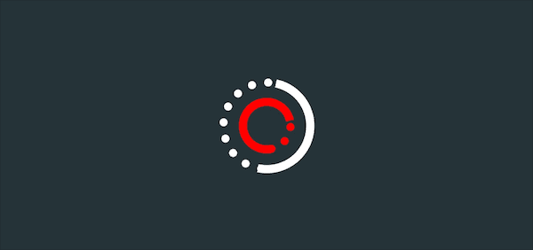
效果展示
Demo代码
HTML
<!DOCTYPE html>
<html lang="en">
<head>
    <meta charset="UTF-8">
    <meta http-equiv="X-UA-Compatible" content="IE=edge">
    <meta name="viewport" content="width=device-width, initial-scale=1.0">
    <link rel="stylesheet" href="style.css">
    <title>Document</title>
</head>
<body>
    <section><span></span></section>
</body>
</html>
CSS
html,body{
  margin: 0;
  height: ;
}
body{
  display: flex;
  justify-content: center;
  align-items: center;
  background: #263238;
}
section {
    width: 650px;
    height: 300px;
    padding: 10px;
    position: relative;
    display: flex;
    align-items: center;
    justify-content: center;
    /* 红色边框仅作提示 */
    border: 2px solid red;
}

span{
  width : 96px;
  height: 96px;
  border: 10px solid white;
  border-style: solid  solid dotted dotted ;
  border-radius: 50%;
  position: relative;
  display: flex;
  align-items: center;
  justify-content: center;
  animation: rotation 2s linear infinite;
}
span::before{
  position: relative;
  content: '';
  width:  48px;
  height:  48px;
  border: 10px  red solid;
  border-style: solid  solid  dotted ;
  border-radius: 50%;
  /* 注意这里的时间 */
  animation: rotationback 1s linear infinite;
}

@keyframes rotation {
  0% { transform: rotate(0deg) }
   { transform: rotate(360deg)
  }
}
@keyframes rotationback {
  0% { transform: rotate(360deg) }
   { transform: rotate(0deg)
  }
}
原理详解
步骤1
使用span标签作为外围白色部分,并设置
- 宽度、高度均为96px
- 边框:白色 10px solid
 width : 96px;
  height: 96px;
  border: 10px solid white;
效果图如下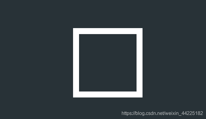
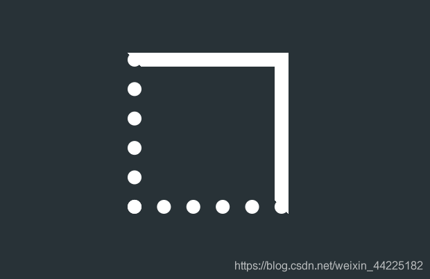
步骤2
设置span边框
- 上/右边框为solid
- 下/左边框为dotter(点状)
border-style: solid solid dotted dotted ;
效果图如下
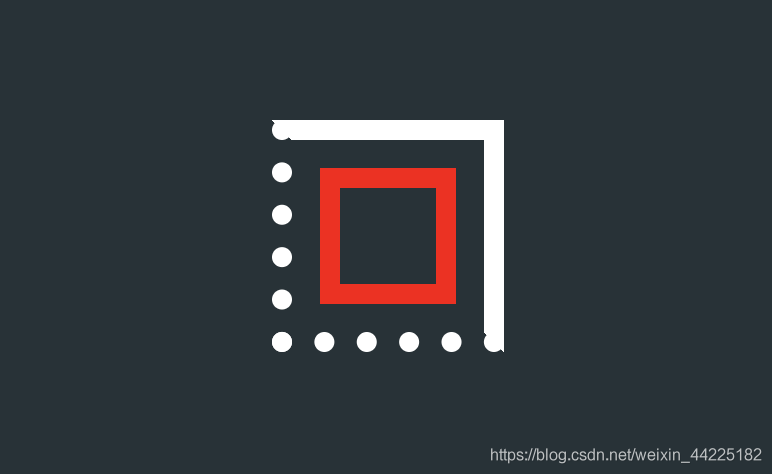
步骤3
使用span::before作为红色部分,并设置
- 相对定位
- 宽度、高度均为48px
- 边框:10px 红色 solid
- 位于白色正方形 正中间(这里使用的是:在span中使用flex布局)
  width:  48px;
  height:  48px;
  border: 10px  red solid;
效果图如下
步骤4
设置span::before边框
- 下边框为dotted
- 其余为solid
border-style: solid solid dotted ;
效果图如下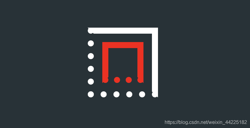
步骤5
span、span::before圆角化
border-radius: 50%;
效果图如下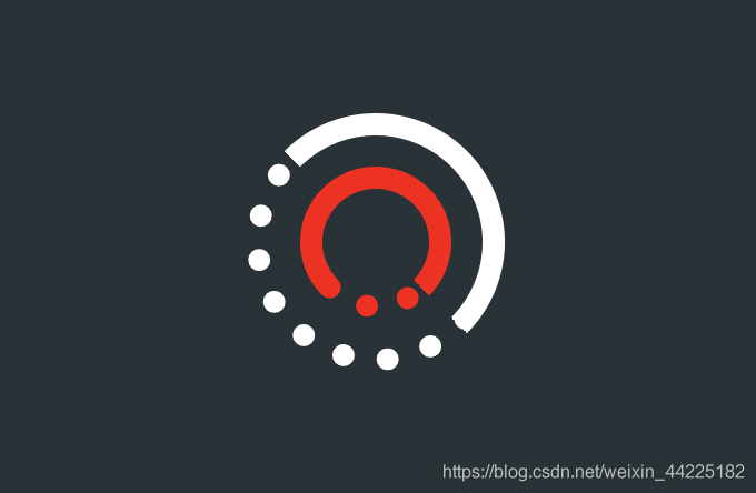
步骤6
为span添加动画
- 顺时针 2s 无限循环
animation: rotation 2s linear infinite;
/*动画实现*/
@keyframes rotation {
  0% { transform: rotate(0deg) }
   { transform: rotate(360deg)
  }
}
效果图如下
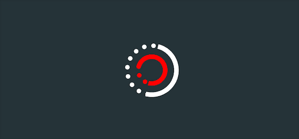
步骤7
为span::before设置动画
-逆时针 1s 无限循环
/*注意时间*/
animation: rotationback 1s linear infinite;
/*动画实现*/
@keyframes rotationback {
  0% { transform: rotate(360deg) }
   { transform: rotate(0deg)
  }
}
效果图如下
结语
学习来源:
https://codepen.io/bhadupranjal/pen/vYLZYqQ
文章仅作为学习笔记,记录从0到1的一个过程。希望对您有所帮助,如有错误欢迎小伙伴指正~
我是海轰ଘ(੭ˊᵕˋ)੭,如果您觉得写得可以的话,请点个赞吧
写作不易,「点赞」+「收藏」+「转发」
谢谢支持❤️
相关文章
-
09
2022-11
-
09
2022-11
-
19
2022-10
-
15
2022-09
-
15
2022-09
-
15
2022-09
推荐阅读
随机推荐
- CSS基础知识
- css如何实现数学的平方/次方
- CSS绘图图标
- CSS前端框架收集
- 引入css的四种方式
- 小程序循环点击使用js添加css样式
- CSS3 文字边框 -webkit-text-stroke 镂空的字体
- CSS页面URL
- 透彻理解CSS位置定位属性
- 在CSS背景图片的background-position中 left top以谁为准?
- 共享40个非常漂亮的HTML5 CSS3网站模板 免费下载模板
- HTML网页设计基础期末考试3354绿色化妆品主页(HTML CSS)
- 【原】CSS实现背景透明,文字不透明,兼容所有浏览器
- 2013年五大主流浏览器 HTML5 和 CSS3 兼容性大比拼
- css和javascript中图片路径的不同
- DIV CSS网页标准化布局(一)
- CSS圆角边框
- CSS position绝对定位absolute relative
- DIV滚动条设置添加 CSS滚动条显示与滚动条隐藏
- 实现《羊了个羊》的小游戏