5分钟搞懂css里面的盒模型_个人文章 - SegmentFault 思否
教你5分钟搞懂css里面的盒模型什么是盒模型在html中,我们写的标签,很多都是有盒模型的,也就是在css里面,我们为这些标签设置样式的时候,实际上就是为这些盒子设置样式。可能这样不是很好理解,我们来
顺晟科技
2021-06-30 17:04:43
235
目录笔记来源:尚硅谷Web前端HTML5&CSS3初学者零基础入门全套完整版
网页是一个多层的结构,一层摁着一层

通过CSS可以分别为每一层来设置样式,作为用户来讲只能看到最顶上一层
这些层中,更底下的一层称为文档流
文档流是网页的基础我们所创建的元素默认都是在文档流中进行排列
对于我们来元素主要有两个状态
那么元素在文档流中有什么特点,我们接着往下看
网页设计中常听的属性名:内容(content)、内边距(padding)、边框(border)、外边距(margin), CSS盒子模型都具备这些属性。
这些属性我们可以用日常生活中的常见事物——盒子作一个比喻来理解,所以叫它盒子模型。
CSS盒子模型就是在网页设计中经常用到的CSS技术所使用的一种思维模型。[1]
CSS将页面中的所有元素都设置为了一个矩形的盒子
将元素设置为矩形的盒子后,对页面的布局就变成将不同的盒子摆放到不同的位置
每一个盒子都由一下几个部分组成:
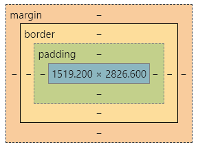
内容区是盒子模型的中心,它呈现了盒子的主要信息内容,这些内容可以是文本、图片等多种类型
元素中的所有的子元素和文本内容都在内容区中
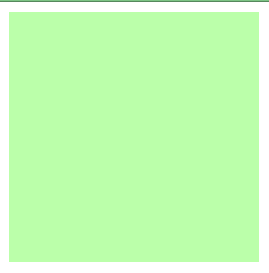
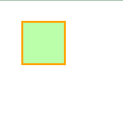
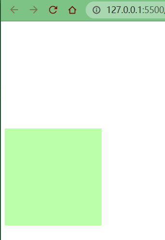
width和height 设置排列内容区的大小width 设置内容区的宽度height 设置内容区的高度示例
.box1{
    width: 200px;
    height: 200px;
    background-color: #bfa;
}
效果
边框属于盒子边缘,边框里边属于盒子内部,出了边框都是盒子的外部
注意:边框的大小会影响到整个盒子的大小
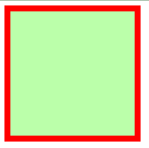
border-width 边框的宽度:默认3px
border-top-width 上边框的宽度border-right-width 右边框的宽度border-bottom-width 下边框的宽度border-left-width 左边框的宽度border-color 边框的颜色:默认使用color的颜色值border-top-color 上边框的颜色border-right-color 右边框的颜色border-bottom-color 下边框的颜色border-left-color 左边框的颜色border-style 边框的样式:没有默认值,必须指定
border-top-style 上边框的样式border-right-style 右边框的样式border-bottom-style 下边框的样式border-left-style 左边框的样式示例
.box1{
border-width: 10px;
border-color: red;
/*
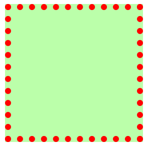
solid 实线
dotted 点状虚线
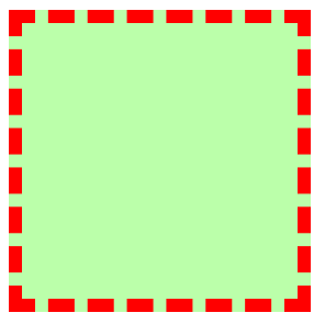
dashed 虚线
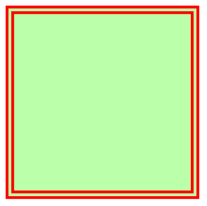
double 双线
*/
border-style: solid;
}
效果(solid)
效果(dotted)
效果(dashed)
效果(double)
不论是border-width 、 border-color 、border-style 还是其衍生出来的属性写法,都可以指定每个方向的边框情况
设定几个值就决定了对应方向的宽度、颜色或样式
上 右 下 左
上 左右 下
上下 左右
上下左右
其实不管设置几个值,只要记住:其顺序是按顺时针方向设置的,剩下的可以由矩形的对称性推导出来
border:简写属性,通过该属性可以同时设置边框所有的相关样式,并且没有顺序要求
border-top 上边框的宽度、颜色和样式border-right 右边框的宽度、颜色和样式border-bottom 下边框的宽度、颜色和样式border-left 左边框的宽度、颜色和样式.box1{
border: 10px red solid;
}
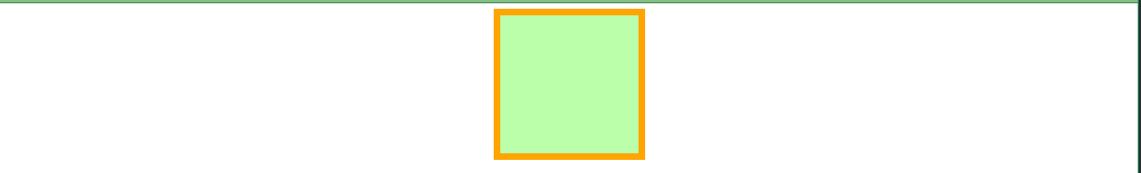
内边距,也叫填充,是内容区和边框之间的空间
padding-top 上内边距padding-right 右内边距padding-bottom 下内边距padding-left 左内边距padding内边距的简写属性,可以同时指定四个方向的内边距,规则和边框中属性值设置一样
注意:内边距的设置会影响到盒子的大小,背景颜色会延伸到内边距上
示例
<style>
    .outer{
        width: 200px;
        height: 200px;
        border: 10px orange solid;
        padding-right: 100px;
        padding-bottom: 100px;
        padding-left: 100px;
    }

    .inner {
        width: 200px;
        height: 200px;
        background-color: greenyellow;
    }
</style>

<div class="outer">
    <div class="inner"></div>
</div>
效果
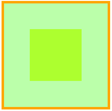
可以看出,当内外div宽度和高度一样时,由于outer设置了一个padding属性,其盒子大小被“撑大了”
盒子可见框的大小,由内容区、内边距和边框共同决定,所以在计算盒子大小时,需要将这三个区域加到一起计算
外边距,也叫空白边,位于盒子的最外围,是添加在边框外周围的空间。空白边使盒子之间不会紧凑地连接在一起,是CSS 布局的一个重要手段
注意:外边距不会影响盒子可见框的大小,但是外边距会影响盒子的位置和占用空间
一共有四个方向的外边距:
margin-top 上外边距
margin-right 右外边距
margin-right不会产生任何效果margin-bottom 下外边距
margin-left 左外边距
元素在页面中是按照自左向右的顺序排列的,所以默认情况下
示例1
.box1 {
    width: 200px;
    height: 200px;
    background-color: #bfa;
    border: 10px orange solid;

    margin-top: 100px;
    margin-right: 100px;
    margin-bottom: 100px;
    margin-left: 100px;
}
效果
示例2
.box1 {
    width: 200px;
    height: 200px;
    background-color: #bfa;
    border: 10px orange solid;
    margin-bottom: 100px;

}

.box2 {
    width: 200px;
    height: 200px;
    background-color: #bfa;
    border: 10px red solid;
    margin-top: 100px;
}
效果
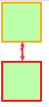
元素在其父元素中水平方向的位置由以下几个属性共同决定
margin-leftborder-left padding-leftwidthpadding-rightborder-rightmargin-right一个元素在其父元素中,水平布局必须要满足以下的等式
margin-left + border-left + padding-left + width + padding-right + border-right + margin-right = 其父元素的宽度
以上等式必须满足,如果相加结果使等式不成立,则称为过渡约束
则等式会自动调整调整的情况:
如果这七个值中没有auto的情况,则浏览器会自动调整margin-right值以使等式满足
100 + 0 + 0 + 200 + 0 + 0 + 0 = 800 ==> 100 + 0 + 0 + 200 + 0 + 0 + 500 = 800
如果这七个值中有auto的情况,则会自动调整auto值以使等式成立
这七个值中有三个值可以设置为auto :width、margin-left、maring-right
如果某个值为auto,则会自动调整auto的那个值以使等式成立200 + 0 + 0 + auto + 0 + 0 + 200 = 600 ==> 200 + 0 + 0 + 400 + 0 + 0 + 200 = 800
auto + 0 + 0 + 200 + 0 + 0 + 200 = 600 ==> 400 + 0 + 0 + 200 + 0 + 0 + 200 = 800
200 + 0 + 0 + 200 + 0 + 0 + auto = 600 ==> 200 + 0 + 0 + 200 + 0 + 0 + 400 = 800
如果宽度为auto,则宽度会调整到更大,其他auto的外边距会自动设置为0
auto + 0 + 0 + auto + 0 + 0 + 200 = 600 ==> 0 + 0 + 0 + 600 + 0 + 0 + 200 = 800
200 + 0 + 0 + auto + 0 + 0 + auto = 600 ==> 200 + 0 + 0 + 600 + 0 + 0 + 0 = 800
auto + 0 + 0 + auto + 0 + 0 + auto = 600 ==> 0 + 0 + 0 + 800 + 0 + 0 + 0 = 800
如果外边距都为auto,则auto的外边距会自动均分以使等式成立
auto + 0 + 0 + 200 + 0 + 0 + auto = 600 ==> 300 + 0 + 0 + 200 + 0 + 0 + 300 = 800

示例
<style>
    .box1 {
        width: 200px;
        height: 200px;
        background-color: #bfa;
        border: 10px orange solid;
        /* 下列条件等价于 margin: 0 auto */
        margin-left: auto;
        margin-right: auto;
    }
</style>
<div class="box1"></div>
效果
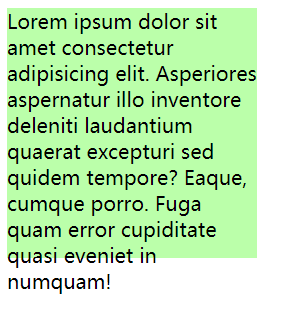
子元素是在父元素的内容区中排列的,如果子元素的大小超过了父元素,则子元素会从父元素中溢出

使用overflow/overflow-x/overflow-y属性来设置父元素如何处理溢出的子元素
可选值:visible/hidden/scroll/auto
visible 溢出内容会在父元素外部位置显示,默认值
示例
<style>
    .box1 {
        width: 200px;
        height: 200px;
        background-color: #bfa;
        border: 10px orange solid;
        overflow: visible; /* 默认值 */
    }
</style>
<div class="box1">
    Lorem ipsum dolor sit amet consectetur adipisicing elit. Asperiores aspernatur illo inventore
    deleniti laudantium quaerat excepturi sed quidem tempore? Eaque, cumque porro. Fuga quam error cupiditate quasi
    eveniet in numquam!
</div>
效果
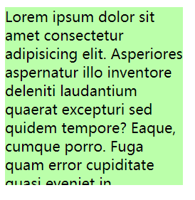
hidden 溢出内容会被裁剪,不会显示
示例
<style>
    .box1 {
        width: 200px;
        height: 200px;
        background-color: #bfa;
        overflow: hidden; /* 隐藏溢出内容 */
    }
</style>
<div class="box1">
    Lorem ipsum dolor sit amet consectetur adipisicing elit. Asperiores aspernatur illo inventore
    deleniti laudantium quaerat excepturi sed quidem tempore? Eaque, cumque porro. Fuga quam error cupiditate quasi
    eveniet in numquam!
</div>
效果
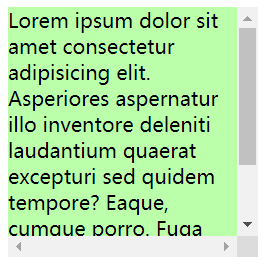
scroll 生成两个滚动条,通过滚动条来查看完整的内容
示例
<style>
    .box1 {
        width: 200px;
        height: 200px;
        background-color: #bfa;
        overflow: scroll;
    }
</style>
<div class="box1">
    Lorem ipsum dolor sit amet consectetur adipisicing elit. Asperiores aspernatur illo inventore
    deleniti laudantium quaerat excepturi sed quidem tempore? Eaque, cumque porro. Fuga quam error cupiditate quasi
    eveniet in numquam!
</div>
效果
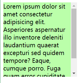
auto 根据需要生成滚动条
示例
<style>
    .box1 {
        width: 200px;
        height: 200px;
        background-color: #bfa;
        overflow: auto;
    }
</style>
<div class="box1">
    Lorem ipsum dolor sit amet consectetur adipisicing elit. Asperiores aspernatur illo inventore
    deleniti laudantium quaerat excepturi sed quidem tempore? Eaque, cumque porro. Fuga quam error cupiditate quasi
    eveniet in numquam!
</div>
效果
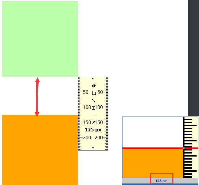
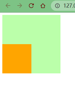
垂直外边距的重叠(折叠):相邻的垂直方向外边距会发生重叠现象
兄弟元素间的相邻,垂直外边距会取两者之间的较大值(两者都是正值)
特殊情况:
示例
.box1,.box2{
    width:200px;
    height:200px;
    font-size:100px;
}

.boxl{
    background-color: #bfa;
    /*设置一个下外边距*/
    margin-bottom: 100px;
}

.box2{
    background-color: orange;
    /*设置一个上外边距*/
    margin-top: 100px;
}
效果
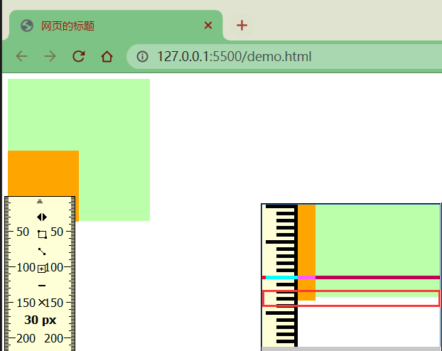
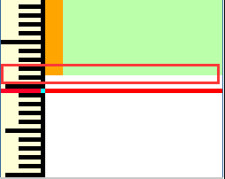
疑问
当浏览器缩放比例是时,我们使用FastStone Capture工具自带的刻度尺测量,发现“兄弟”之间似乎没有我们想象的那么“亲近”
两者的垂直方向间距是125px,我们明明上下元素设置的都是100px啊,这是为什么呢?
在网页布局中,通过谷歌浏览器或火狐浏览器预览时,发现我们定义的盒模型width,height,margin,padding 值都是不准确的
谷歌、火狐浏览器 缩放为80% 时,margin值才正确[2]
总结
兄弟元素之间的外边距的重叠,对于开发是有利的,所以我们不需要进行处理
父子元素间相邻外边距,子元素会传递给父元素(上外边距)
示例
.box3{
width:200px;
    height:200px;
    background-color: #bfa;
}

.box4{
    width: 100px;
    height: 100px;
    background-color: orange;
    /* margin-top: 100px; */
}
效果


父子外边距的折叠会影响到页面的布局,必须要进行处理

处理方式1
1、我们转换思路,将对子元素的调整转为对父元素的调整
.box3 {
    width: 200px;
    height: 200px;
    background-color: #bfa;
    padding-top: 100px; /* 不调整子元素的margin,而是转而调整父元素的padding */
}

.box4 {
    width: 100px;
    height: 100px;
    background-color: orange;
    /* margin-top: 100px; */
}
效果
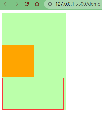
可以看到父元素位置虽然正确了,但是高度却被“撑大了”。我们之前说过,padding属性会影响元素的大小
2、这里我们还需要计算并手动调整下父元素的高度
.box3 {
    width: 200px;
    height: 100px; /* height: 200px; */
    background-color: #bfa;
    padding-top: 100px;
}

.box4 {
    width: 100px;
    height: 100px;
    background-color: orange;
}
效果
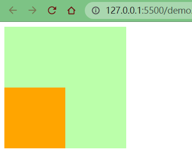
处理方式2
1、我们仍然保留子元素的margin-top属性,但是给父元素加一个上边框
.box3 {
    width: 200px;
    height: 200px;
    background-color: #bfa;
    border-top: 1px rebeccapurple solid; /* 在父元素上加一个border-top(上边框) */
}

.box4 {
    width: 100px;
    height: 100px;
    background-color: orange;
    margin-top: 100px; /* 不删除,保留 */
}
效果
2、但是因为加了1px的边框,所以父元素盒子的高度也增加了1px。那我们就需要手动调整父元素的高度,同时让边框颜色与父元素盒子颜色保持一致
.box3 {
    width: 200px;
    height: 199px; /* height: 200px; */
    background-color: #bfa;
    border-top: 1px #bfa solid;
}

.box4 {
    width: 100px;
    height: 100px;
    background-color: orange;
    margin-top: 100px;
}
但是我们没有发现一个问题不难发现一个问题,子元素也往下移动了1px的距离
因为父元素高度少了1px,而子元素的margin-top是从边框下面开始算的
所以,凭借大家朴素的情感,哪个应该怎么判? 应该怎么改?

改法也很简单,margin-top减去一个像素即可
.box3 {
    width: 200px;
    height: 199px;
    background-color: #bfa;
    border-top: 1px #bfa solid;
}

.box4 {
    width: 100px;
    height: 100px;
    background-color: orange;
    margin-top: 99px; /* margin-top: 100px; */
}
效果
同时,我们用刻度尺测量,父子元素底部是在一条水平线上的
上述示例2中,使用了border属性,就让子元素的外边距不去传递给父元素了,这是为什么呢?
margin (子元素远离父元素边框)[3]
如果父盒子没有设置border框着,那么他的子元素无法利用margin-top 来远离父元素的上边框
如果使用了margin-top会使子元素和父元素一起往下移
(子想离,父不设置border边框 则离得是流 不是父盒子)

应该是border让元素脱离了文档流(margin塌陷)

好吧好吧,至于什么是margin塌陷,我也是问了度娘,有兴趣的可以自行百度,这里就不再赘述了
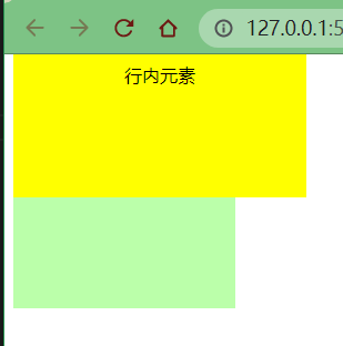
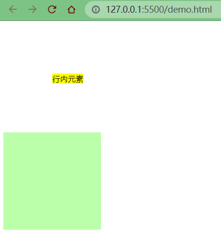
行内元素不支持设置宽度和高度
.s1 {
    /* 行内元素设置了宽高也没用,不会生效 */
    width: 100px;
    height: 100px;
    background-color: yellow;
}

行内元素可以设置padding,但是垂直方向padding不会影响页面的布局
.s1 {
    /* 下方的div元素并没有因span设置了padding属性,而受到位置上的影响 */
    padding: 100px;
    background-color: yellow;
}

.box1 {
    width: 200px;
    height: 200px;
    background-color: #bfa;
}
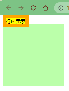
行内元素可以设置border,垂直方向的border不会影响页面的布局
.s1 {
    border: 10px orange solid;
    background-color: yellow;
}

.box1 {
    width: 200px;
    height: 200px;
    background-color: #bfa;
}
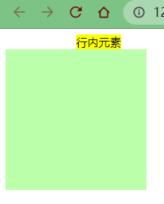
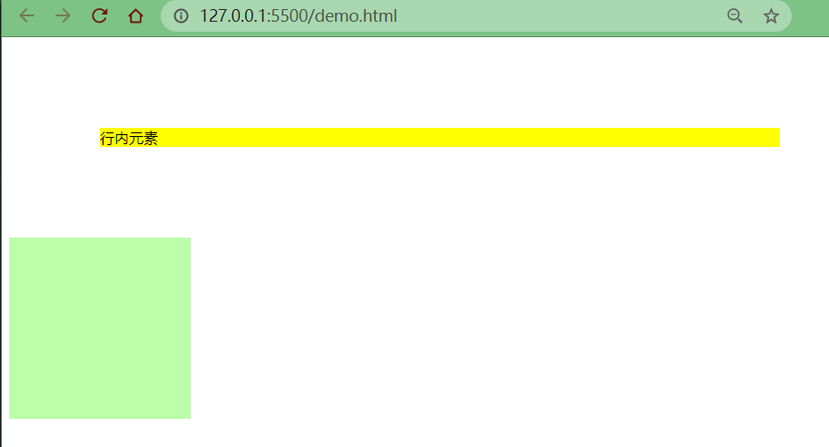
行内元素可以设置margin,垂直方向的margin不会影响页面的布局
.s1 {
    margin: 100px;
    background-color: yellow;
}

.box1 {
    width: 200px;
    height: 200px;
    background-color: #bfa;
}
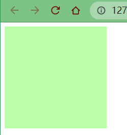
如果我就是想要行内元素对页面布局产生影响呢?
那就拉出去枪毙了! 那也是有办法的!
display用来设置元素显示的类型
inline将元素设置为行内元素
block 将元素设置为块元素
.s1 {
    margin: 100px;
    background-color: yellow;
    /* 将行内元素设置为块元素 */
    display: block;
}
inline-block 将元素设置为行内块元素行内块,既可以设置宽度和高度又不会独占一行
.s1 {
    margin: 100px;
    background-color: yellow;
    /* 将行内元素设置为行内块元素,兼顾行内元素和块元素的特点 */
    display: inline-block;
}
table将元素设置为一个表格
none元素不在页面中显示
.s1 {
    margin: 100px;
    background-color: yellow;
    /* 将行内元素设置为none:不显示 */
    display: none;
}
不显示是不显示了,但是原来属于s1的位置也没了

visibility用来设置元素的显示状态
visible默认值,元素在页面中正常显示
hidden元素在页面中隐藏不显示,但是依然占据页面的位置
.s1 {
    margin: 100px;
    background-color: yellow;
    display: block;
    visibility: hidden;
}

通常情况,浏览器都会为元素设置一些默认样式
默认样式的存在会影响到页面的布局,通常情况下编写网页时必须要去除浏览器的默认样式(PC端的页面)
在当今网页设计/开发实践中,使用CSS来为语义化的(X)HTML标记添加样式风格是重要的关键。
在设计师们的梦想中都存在着这样的一个完美世界:所有的浏览器都能够理解和适用多有CSS规则,并且呈现相同的视觉效果(没有兼容性问题)。
但是,我们并没有生活在这个完美的世界,现实中发生的失窃却总是恰恰相反,很多CSS样式在不同的浏览器中有着不同的解释和呈现。
当今流行的浏览器(如:Firefox、Opera、Internet Explorer、Chrome、Safari等等)中,有一些都是以自己的方式去理解CSS规范,这就会导致有的浏览器对CSS的解释与设计师的CSS定义初衷相冲突,使得网页的样子在某些浏览器下能正确按照设计师的想法显示
而且有些浏览器却并没有按照设计师想要的样子显示出来,这就导致浏览器的兼容性问题。
更糟的是,有的浏览器完全无视CSS的一些声明和属性。[4]
我们可以尝试编写css样式,以去除浏览器的默认样式
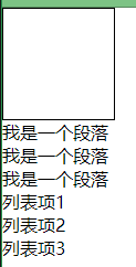
示例
html代码
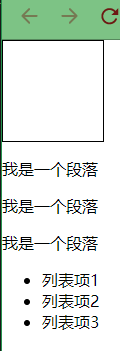
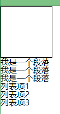
<div class="box1"></div>
<p>我是一个段落</p>
<p>我是一个段落</p>
<p>我是一个段落</p>
<ul>
<1i>列表项1</1i>
<1i>列表项2</1i>
<1i>列表项3</1i>
</ul>
css代码
.box1{
    width: 100px;
    height: 100px;
    border: 1px solid black;
}
效果
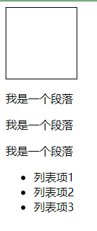
F12看盒子默认样式
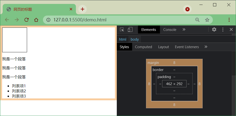
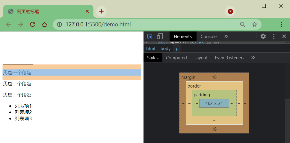
段落之间有16px的默认行距
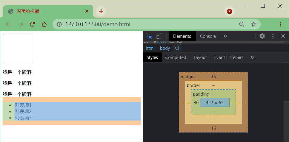
列表外有16px的上下外边距和40px的左内边距,而且每项列表前有一个小黑点
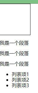
去除默认样式
去除与浏览器的边缘间距
body {
    margin: 0;
}
去除段落之间行距
p {
    margin: 0;
}
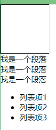
去除列表的上下外边距和左内边距
ul {
    margin: 0;
    padding: 0;
}
我们只是去除了列表的内外边距,但是发现前面的黑点也消失了,真的如此吗?

我们先给ul加上一个margin-left
ul {
    margin: 0;
    padding: 0;
    margin-left: 16px;
}
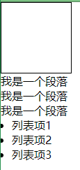
看来黑点并没有自动清除,而只是“缩进”了浏览器的左侧
去除列表前的黑点
ul {
    margin: 0;
    padding: 0;
    margin-left: 16px;
    list-style: none;
}
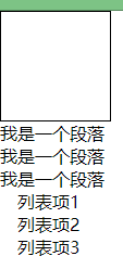
再将之前加的16px的margin-left样式去除
ul {
    margin: 0;
    padding: 0;
    /* margin-left: 16px; */
    list-style: none;
}
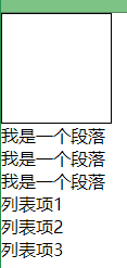
到这里似乎就大功告成了,但是我们会发现写法似乎 很完美 有点麻烦
body {
    margin: 0;
}

p {
    margin: 0;
}

ul {
    margin: 0;
    padding: 0;
    list-style: none;
}
有没有简化空间了呢?
答案是肯定的,我们前面介绍过通配选择器的概念,可以直接简化成一个
简化写法
* {
    margin: 0;
    padding: 0;
    list-style: none;
}
效果是一样的
去除浏览器的默认样式的需求是非常普遍的,我们难道每次都需要手动去除浏览器的默认样式?
这样岂不是很麻烦,难道官方就没有想到解决方案吗?
答案也是肯定的,有!

正因为上述冲突和问题依然存在于这个”不完美的世界”,所以一些设计师想到了一种避免浏览器兼容性问题的方法,那就是CSS Reset
什么是CSS Reset?
我们可以把它叫做CSS重设,也有人叫做CSS复位、默认CSS、CSS重置等。
CSS重设就是先定义好一些CSS样式,来让所有浏览器都按照同样的规则解释CSS,这样就能避免发生这种问题。[4:1]
下方两种css样式,我们引入其中一个即可
官方地址:reset.css
<link rel="stylesheet" href="assets/reset.css">
效果
我们可以看到reset.css的作用就是将各个内外边距置为0,将一些样式置为none
/* http://meyerweb.com/eric/tools/css/reset/
   v2.0 | 20110126
   License: none (public domain)
*/

html, body, div, span, applet, object, iframe,
h1, h2, h3, h4, h5, h6, p, blockquote, pre,
a, abbr, acronym, address, big, cite, code,
del, dfn, em, img, ins, kbd, q, s, samp,
small, strike, strong, sub, sup, tt, var,
b, u, i, center,
dl, dt, dd, ol, ul, li,
fieldset, form, label, legend,
table, caption, tbody, tfoot, thead, tr, th, td,
article, aside, canvas, details, embed,
figure, figcaption, footer, header, hgroup,
menu, nav, output, ruby, section, summary,
time, mark, audio, video {
	margin: 0;
	padding: 0;
	border: 0;
	font-size: ;
	font: inherit;
	vertical-align: baseline;
}
/* HTML5 display-role reset for older browsers */
article, aside, details, figcaption, figure,
footer, header, hgroup, menu, nav, section {
	display: block;
}
body {
	line-height: 1;
}
ol, ul {
	list-style: none;
}
blockquote, q {
	quotes: none;
}
blockquote:before, blockquote:after,
q:before, q:after {
	content: '';
	content: none;
}
table {
	border-collapse: collapse;
	border-spacing: 0;
}
官方地址:normalize.css
<link rel="stylesheet" href="assets/normalize.css">
效果
这里并没有去除所有样式,因为normalize的作用不同于reset。reset是将所有默认样式去除,而normalize是将所有默认样式统一,这样在不同的浏览器里显示效果也是统一的
至于文件内容就不再这里赘述了,感兴趣的可以仔细研究
参考资料
CSS盒子模型:https://baike.baidu.com/item/CSS盒子模型/9814562?fr=aladdin ↩︎
谷歌、火狐浏览器 缩放为80% 时,margin值才正确:https://www.likecs.com/taohuaya/p/7642742.html ↩︎
margin(子元素远离父元素边框):https://www.likecs.com/FlFtFw/p/9627026.html ↩︎
目前比较全的CSS重设(reset)方法总结:https://www.likecs.com/hnyei/archive/2011/10/04/2198779.html ↩︎ ↩︎
19
2022-10
19
2022-10
19
2022-10
15
2022-09
15
2022-09
14
2022-09