本文将介绍如何使用 HTML/CSS 创建各种基础进度条及花式进度条及其动画的方式,通过本文,你可能可以学会:通过 HTML 标签 创建进度条通过 HTML 标签
箭头流程进度条(两种方法) - 未来穗香">HTML+CSS-->箭头流程进度条(两种方法) - 未来穗香
顺晟科技
2022-09-13 14:26:52
287
1、伪类
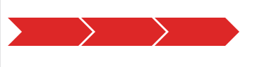
2、移动
html
<!--1、用伪类画箭头部分--> <divclass="test"></div> <divclass="test"></div> <divclass="test"></div> <br/><br/><br/> <!--2、红箭头是单独的盒子,通过移动显示出箭头--> <divid="progress"> <divclass="bg-red"> </div> <divclass="bg-red"> <divclass="triangle-box"> <divclass="trianglebg-red"></div> </div> </div> <divclass="bg-red"> <divclass="triangle-box"> <divclass="trianglebg-red"></div> </div> </div> <divclass="bg-gray"> <divclass="triangle-box"> <divclass="trianglebg-red"></div> </div> </div> </div>CSS
/*1、使用伪类画箭头部分*/ .test{ float:left; margin:02px0; width:100px; height:40px; background-color:#DD2727; position:relative; } .test:after{ content:\'\'; display:block; border-top:20pxsolidtransparent; border-bottom:20pxsolidtransparent; border-left:20pxsolid#DD2727; position:absolute; top:0; left:100px; z-index:10; } .test:before{ content:\'\'; display:block; border-top:20pxsolidtransparent; border-bottom:20pxsolidtransparent; border-left:20pxsolidwhite;}
/*2、红箭头是单独的盒子,通过移动显示出箭头*/ #progress{ display:flex; justify-content:start; } #progress>div{ width:100px; height:34px; line-height:35px; color:white; position:relative; text-align:center; } /*三角形*/ .triangle-box{ display:inline-block; width:20px; height:34px; overflow:hidden; position:absolute; left:0; } .triangle{ transform:rotate(45deg); transform-origin:lefttop; position:absolute; top:-3px; left:-1px; width:25px; height:25px; border:2pxsolidwhite; } /*红色、灰色背景*/ .bg-red{ background-color:#DD2727; } .bg-gray{ background-color:#CCCCCC; }
posted on 2021-03-05 18:24 未来穗香 阅读(73) 评论(0) 编辑 收藏 举报
相关文章
-
15
2022-09
-
14
2022-09
-
14
2022-09
-
14
2022-09
-
14
2022-09
-
13
2022-09
推荐阅读
随机推荐
- 如何使用纯CSS绘制三角形
- 《新山原》Selenium3.0基础-8 使用CSS选择器定位元素
- 将纯前端报表设计器集成到React框架中
- 利用css动画属性rotate来实现镜像翻转
- 缩放CSS样式背景图片设置
- 控制承诺面试问题详解并发
- MiracleSnow网页设计HTML5 CSS3 JS完整视频教程
- CSS和SVG实现文字渐变、描边和投影
- 浏览器的工作方式和V8引擎
- html、css以及javascript的注释方式
- Css_Backgroud-position(背景图片)定位问题详解
- CSS 盒子的边距塌陷
- [Python]神器:细流 只用Python开发一个运维管理后台(不需要写html js css)
- CSS秘密的linear-gradient
- 用CSS实现垂直居中的四种方法
- 使用CSS强制换行word-break和word-wrap
- CSS格式化排版
- DIV CSS圆角边框DIV CSS圆角边框
- CSS制作的32种图形效果[梯形|三角|椭圆|平行四边形|菱形|四分之一圆|旗帜]
- 掌握CSS中的z-index